top of page


Blending faith, renewal, and personality into a cohesive identity.
Client: AP Therapy Massage
Industry: Health & Wellness
Scope: Brand Identity, Website Design, Marketing Materials
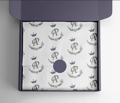
For AP Therapy Massage, I created a brand identity that blends peace and professionalism with a touch of personality. The design centers around the AP monogram paired with a hand-drawn olive branch illustration, a meaningful symbol of faith, peace, healing, and renewal.
The color palette combines soft, soothing tones with a bold pop of purple, reflecting April's vibrant personality and pageant influences. Paired with clean, approachable typography and gentle visual elements, the brand feels restorative, personal, and inviting.
_edited_edited.png)


bottom of page